
Tuesday, 30 April 2013


Contents design final decision
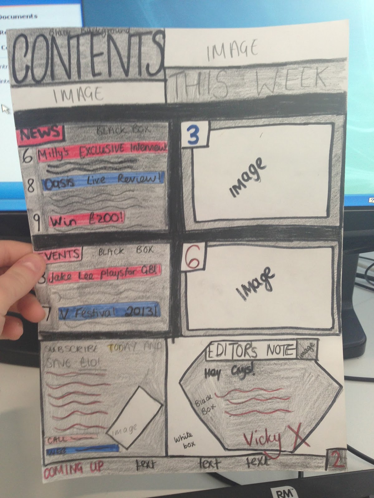
I have chosen to use sketch 2 as my final contents page design as I feel it will target more people into buying my magazine as the images and text are balanced on the page- suitable for more mature and younger audiences and will make the contents page look brighter.
I have also chosen this sketch because I feel that the colour schemes (Red, Black and white) are appropriate because it will tie in more with my front cover. Keeping a consistent colour theme throughout my magazine will make it look more professional and more interesting to read.
I have also chosen sketch 2 as I feel the editors note is more prominent and more important on this sketch, as most conventional music magazines feature an editors note which is why mine should stand out to make my contents page look as realistic as possible.
I have also chosen sketch 2 as I feel the subscription box is important on my contents page to attract more customer interest. Most rock/indie magazines will feature a promotional subscription offer to keep a loyal customer base for the magazine and featuring this offer on my contents page will give the page a more realistic look.


Friday, 26 April 2013


Wednesday, 24 April 2013


Sunday, 14 April 2013
Writeup of Questionnaire Results.
Analysis of Results writeup.
The name of my magazine
will be Indie-Pendant as 30 people preferred this magazine name to the other
choices. I feel that this magazine title name will fit in more with my magazine
style and layout. The age range of the people asked was between 0-41+, and the
majority of the people that took the questionnaire were between 11-20 years of
age. This is ideal as they will be the niche market for my teenager targeted
magazine.
The colour schemes that
were chosen for my magazine were orange, red and yellow colours. I feel that
this colour scheme would work well for my magazine and I will use this colour
scheme throughout as bright and vibrant colours are vital to stand out to
attract the attention of the consumers on the magazine shelf. I will also
include the colour black to give the magazine an edgy look, and black will make
the page become bolder and will stand out.
Additionally, the music
genres that were favored to feature in my magazine were jazz and rock bands. I
will use jazz and rock bands in my magazine to meet the requirements of my
target audience so more people will purchase the magazine. I will also feature
some pop and indie bands to also tie in with the jazz and rock theme, and to
possibly expand my target market so more people will be interested in my
magazine.
From my research, the
majority of the people interviewed wanted a celebrity interview in the magazine.
I have decided to feature a celebrity interview within my magazine to expand
the audience of my magazine to feature the celebrities fan base, so they will
be interested in “Indie-Pendant” and to keep my readers entertained with
celebrity content.
Although most people from
my research would only pay up to £1.00 for my magazine, I have decided to set
the price a little higher at £1.50 as I felt that £1.00 was too cheap for my
magazine price. Looking at the prices of NME (£2.20), Kerrang (£2.20) and Q
(around £3.50), I didn’t want to set my magazine too cheap.
My magazine will become weekly
to tie in with most other mainstream magazine to make sure the consumers get up
to date information on their favourite music bands. Most people from my
research wanted a free poster in my magazine. I will give the free poster gift
so my consumers feel valued.


Magazine Questionnaire.
Music Magazine Questionnaire. For my magazine research, I asked 50 people a series of questions to gather results into making my music magazine. Here are the questions I asked...


Friday, 12 April 2013


Subscribe to:
Comments (Atom)